


Awakening an Icon
Arne Jacobsen is probably the most well known Danish architect. Not only did he create amazing buildings, but he also designed everything around it like Chairs, glasses, door handles, and… clocks.
Arne Jacobsen Clocks needed a new take to be relevant to the modern customer. Customers who never owned an alarm clock, but who (+70%) sleeps with their mobile phone right next to the bed every night!.. and that is not good for you!
In the Spring of 2020, we launched three new clock styles. The communication goal was to make people realize they needed a new alarm clock and that Arne Jacobsen was an obvious and stylish choice.

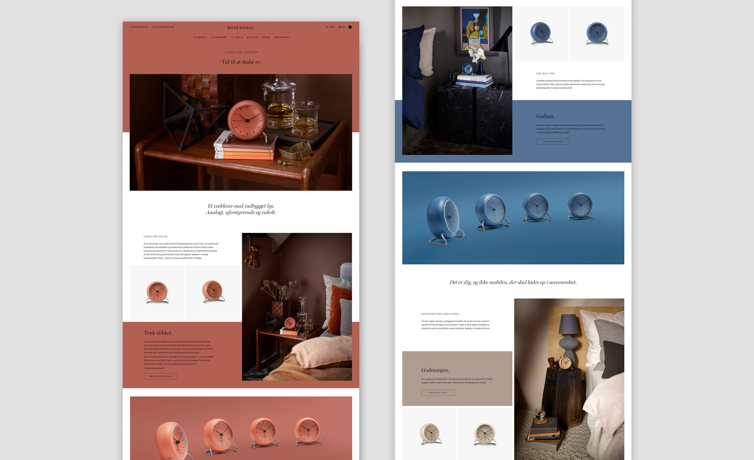
Awaken an icon through a strong visual identity, a precise positioning, and relevant storytelling.

Assets for the launch of SS20 - ensuring a strong identity across all customer touchpoints.
Overall photo and graphic identity
Homepage visual identity
Copy and wording
Instagram posts and stories
Newsletter templates
Print ad templates and layout
In-store display concept


A concept illustration from the photo brief “Goodnight Tom Ford,” styled by Darling Creative Studio.

Never mind the seconds.
There are no seconds hand on an Arne Jacobsen clock because the bedroom is a place where you must recharge your "own" batteries and forget about time and place. Even if you feel that every second count in your wakeful hours, it's essential to your wellbeing to forget about time when you need to sleep and recuperate.
Challenge: Turn a "missing" feature into an advantage.
Concept: Michael Rying
Copy: Super Blah


